Picture Credit: Kasey Moore / What’s on Netflix
Over the past year, we’ve watched Netflix drastically overhaul its interface across televisions and smartphones. Now, it looks like the desktop web browser experience is finally getting its turn with a fresh coat of paint, albeit it’s just early testing and quite limited in scope.
If you’re logging onto Netflix.com on your computer, some users might notice things look a little different. While the core layout remains largely the same, Netflix is rolling out a visual refresh to its web UI that aligns it much closer to the TV experience.
Take a look at the new layout:
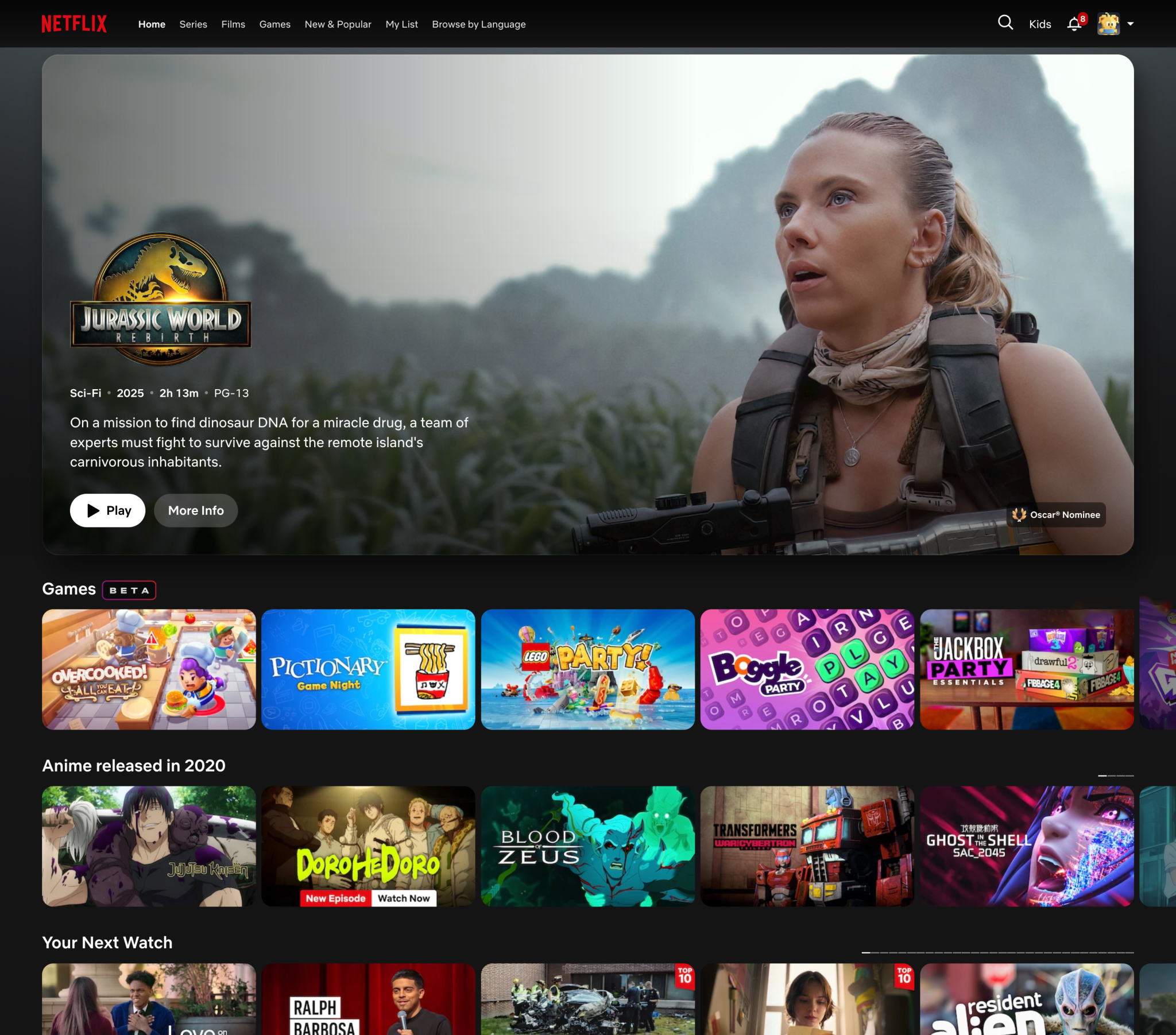
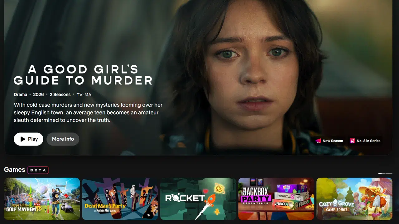
(Pictured above: The refreshed Netflix web UI featuring a prominent hero banner for ‘Jurassic World: Rebirth’ and new TV-style rows).
Instead of a total teardown, Netflix has opted to refine the existing interface. The visual presentation of the title boxes has been tweaked to look slightly more rounded and dynamic—echoing the exact aesthetic you get when browsing on your Roku, Apple TV, or Smart TV. You’ve also got the gradient background, which responds to the title being shown. Animations seem a little bit snappier, too, although the pagination of its rows (the little boxes indicating how far along the row you are on) looks a little clunky in my book. Across my profiles too, I’ve noticed Games take a way more prominent role, usually always appearing as the second row.
The most noticeable addition to this web refresh is the extra metadata now coming through directly on the box art. Much like on the big screen, as you scroll through rows, you’ll now see handy little tags sitting at the bottom of the tiles flagging things like “New Season Coming,” “Recently Added,” or “Highly Rewatched.” It’s a great quality-of-life update that gives you more context before you even click or hover over a title.
The changes haven’t been implemented sitewide, though. While all the individual tiles have been rounded, standard top-level and sub-level Category pages are the same for me. Likewise, tapping into a title for the moment is the same as before.
Part of a Gradual Web Overhaul
This visual facelift shouldn’t come as a massive surprise if you’ve been following our coverage. Throughout this year, we’ve noticed a ton of behind-the-scenes changes and minor tweaks on the web version of Netflix as they’ve laid the groundwork for this update.
For instance, earlier this year, Netflix quietly removed the A-Z and other sorting options from the web UI, signaling that a broader navigation shift was underway. Months before that, we also spotted Netflix removing the “Netflix Original” branding label from tiles on the web, leaning towards the cleaner, less cluttered look we are seeing finalized today.
Bringing the Ecosystem Together
This web refresh brings the desktop browser in line with the rest of Netflix’s ecosystem, which has seen some dramatic and highly publicized shifts recently.
On the big screen, Netflix has been rolling out its massive new TV app UI for the past two years which fully rolled out throughout last year and into this year. A mobile refresh also came alongside it.
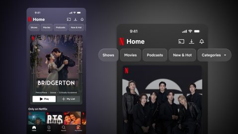
Just last month, the mobile UI got another evolution update. The smartphone app introduced new navigation menus and an emphasis on clips, ultimately leading to the removal of the “New & Popular” tab to make way for the new layout.
With the web UI now reflecting these TV-style tiles and metadata badges, it seems Netflix is finally planning unified its design language across all your screens.\
Have you noticed the new web UI on your account yet? What do you think of the new metadata tags and the TV-aligned tiles? Let us know in the comments down below!