Picture: Netflix
The Netflix UI overhaul has been in the works for a long time, and last month, Netflix officially unveiled plans to roll it out globally after an extended period of testing. Now that more Netflix users are getting the UI in their hands, what are their thoughts? Have opinions moved on from last year, when feedback, at least when posted online, was mostly negative?
In case you missed it, on May 7th, Netflix officially announced its brand new TV interface overhaul. It’d been a while in the works with Netflix having begun testing this new user interface, designed for connected devices such as a games console or television, in mid-2024. We highlighted a month after that, several journalists and members of the general public had been put through that small test and voiced their opinions. Looking back, most of their criticisms remain now that it’s rolling out globally.
What was really hard to gauge then, and remains so now, is how much this online chatter truly represents the overall Netflix user base. We also don’t know how many people even have the new UI either. It began its rollout in May, but the countries or percentage of the user base it has reached are unclear. We should also note that we did find some Netflix users who did like new UI but they were in the minority.
Netflix, in its call with journalists last month, was asked about the feedback the team had received. “We’ve been working on this and testing the new experience since last year,” said Eunice Kim, Chief Product Officer at Netflix, continuing, “[we’re] very excited about the feedback we’ve seen from members who do tell us that they prefer the new experience. We’ve done a lot to optimize it and make sure that it’s working well for our members along the way, and so we’re excited to bring it to everyone across the world in the next weeks and months.”
Browsing the Netflix Subreddit for any length of time will reveal a slew of disappointed Netflix members highlighting some of their personal gripes. Most of these gripes fall into several camps:
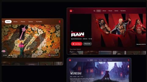
- How many items occupy the screen – The largest complaint, by far and away, is the number of shows or movies that occupy the screen at any given time. Whereas before a row would consist of 7 posters, that’s now significantly reduced with boxes auto-expanding and playing previews. Some users rightly point out that their mobile device, while browsing, now displays more titles at any given time than their big living room TV.
- Missing/Removed Features – As we reported soon after the announcement of the global rollout, two popular features have been removed. This includes the New & Popular tab, which provides a way to see the top 10s as well as a selection of what’s coming up this week, next, and beyond at a glance – something not now possible in the new update. Categories also got removed, although we’ve seen fewer people bothered about that.
- My Netflix and Home are identical – Netflix made a lot about what the difference was between the new My Netflix tab and the Home one, but for the most part, they feature predominantly the same rows and items.
Several others have criticized the way My List is now displayed within the app, as a vertical scroll. Others report bugs, such as missing thumbs-up ratings they’ve provided over the years. Others have questioned why games now occupy an entire tab when they are not being used. In a few rare instances, some also criticized the performance on their hardware.
Here’s a selection of the complaints we found online: “It is the biggest downgrade of service I have seen. Scrolling through titles is 10x slower, no upcoming videos. Home and My Netflix are pretty much the same thing. So 3 tabs, 2 of them almost identical”
“I opened up the app today and found it immediately annoying to use. There’s no quick way to see if I rated something previously anymore and way too much scrolling is required because they decided to size up elements. I’m guessing they thought it would feel more sleek and polished, but it just seems cramped for how little is on the screen instead.”
You can also find criticism across YouTube, Facebook, and, of course, Twitter. Here’s also a selection of Tweets we found on Twitter:
The new @netflix TV UI is honestly terrible. It’s harder to navigate and less usable. Judging from Reddit during test, most feedback has been negative—so how did this get approved?
Are you trying to get people to unsubscribe?
Please give us the option to revert to the old UI.
— th3n41 (@th3n41) June 3, 2025
Hey @netflix , fire whoever approved this new UI.
Can't even put a reminder on any upcoming Shows/Movies, cause I can't even see them!
Also, eye cancer cause those previews are so gigantic.
Were you high when you thought this was something people wanted? pic.twitter.com/8MDnDZwcmC
— Jay (@JayAtCorcel) June 1, 2025
Look I don't want to be overly negative but that new @netflix @NetflixUK layout has got to be reverted. It might honestly be the most horrendous interface upgrade I have ever seen on a major streaming app. I might genuinely cancel my subscription over it. Brutal.
— 𝔸𝕟𝕕𝕣𝕖𝕨 🔰 (@Only1Digginz) June 5, 2025
Can you revert the new Netflix UI back to the old UI?
Simply put – no.
Eventually, this UI rollout is coming for us all, and while I’ve heard from some users that their UI changes back and forth from the new UI to the old one quite often (likely part of A/B testing to collect results), for the most part, it’s now outside of your control.
In the run-up to this wider rollout, you were able to turn off experiments by navigating to this page in the Netflix account settings and clicking the off toggle on “Include me in tests and previews.”
It’ll be interesting to see how this develops in the coming weeks and what the data is telling Netflix. Again, from my perspective, it’s incredibly hard to gauge whether the people found above or friends and colleagues who have also had a mostly negative experience are the majority or the minority.
Over to you – have you been given the new Netflix UI interface overhaul yet? What do you think? Let us know in the comments down below.