Netflix UI and Tech – Picture: Adobe Stock
With the Streaming Wars well into their 2nd year, Netflix’s new competitors have had time to grow and develop their own unique user interfaces and feature sets but is Netflix still king when it comes to tech, UI and feature sets? Let’s dive in and see how other streamers compare in 2022.
While Netflix has had a considerable head start (their Streaming Video On-Demand [SVOD] app launched in 2007), their UI still isn’t perfect and there are still features they could add. Due to the nature of consumer behaviors, no service will ever be “feature-complete” or done revising their looks. If things stay the same too long, people will grow bored or frustrated.
If other services add enticing new features and Netflix does not catch up, they may find themselves in a position they have never been before… behind. Let’s see how Netflix stacks up against longtime competitors Hulu and Prime Video as well as the newer challengers, Disney+, Peacock, HBO Max, and Paramount+.
First, let’s look at each service’s feature set using this chart courtesy DejaView News.
Comparing Streaming Service Features in 2022

Comparison of the major streaming services by features available using this handy chart courtesy DejaView News.
Note: To keep it consistent and fair, we’ll be using each service’s desktop UI and TV.
One thing immediately jumps out: Netflix has the largest feature set of any service.
Based on this chart, the closest to catching up is Prime Video (thanks to their upgraded UI) and Paramount+.
Despite being around the 2nd longest, Hulu has not been very innovative and doesn’t advance much. Now that the ownership is split between just Comcast and Disney, the future of the service is up in the air.
Activist investor Daniel Loeb is far from the only one calling for Hulu to fold into Disney+. Since there is a lot to unpack, I’ll focus on some pros and cons of each service and hopefully walk away from this with a sense of how Netflix can still improve.
Netflix
Pros:
- The largest feature set overall
- Most reliable and best tested
- Shuffle was highly requested
- Most reliable binge experience / “play next episode”
- The coming soon section is filled with content
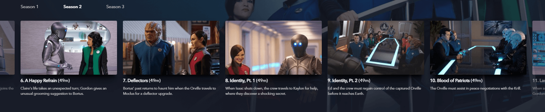
- Best navigation from within the player (change episodes without leaving)
- Autoplay trailers on browsing help select titles
Cons:
- No curated/linear channels
- No “GroupWatch”
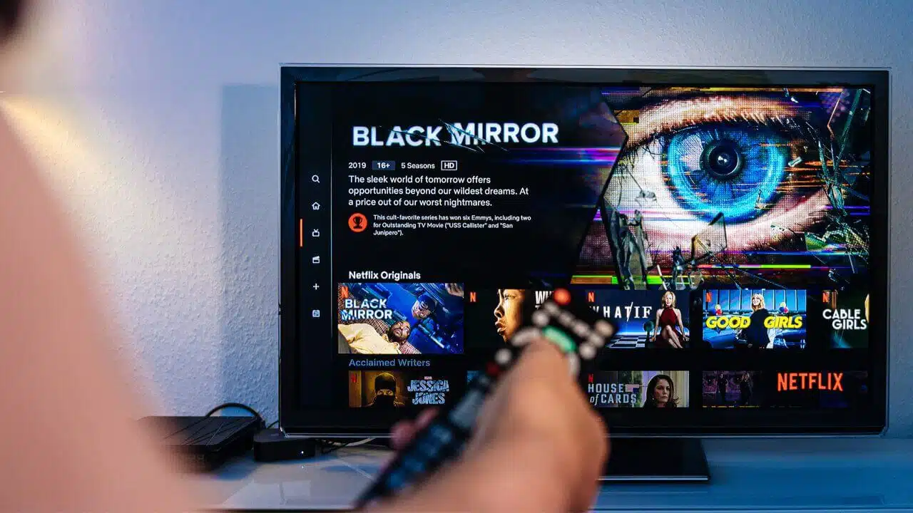
Netflix’s UI is great but the title pages should occupy more of the page width to make them less cluttered and easier to read.
Netflix does not offer curated linear channels, one of only 3 missing features on this chart.
There was talk a year or so ago that they were testing this feature in France, but it doesn’t look it made it far. As bizarre as it might seem, linear channels on streaming are becoming more popular because some people just want that traditional TV experience of joining something already in progress and watching it for a while. Some want the difficult task of choosing a title automated. Sure, there is a shuffle feature on Netflix, but it’s not the same. Another reason linear channels are a “must have” is because it gives cord-cutting families the ability to leave their kid in front of the TV without having to keep returning to hit “Play” on a new title.
The lack of a GroupWatch feature is surprising because Disney+ added one shortly after the launch.
Soon after, Hulu and Prime Video followed. There have long been 3rd party extensions and software allowing people to watch Netflix together, so it’s shocking that with the clear demand and the newfound need to “keep up” with competitors, they did not add a similar, better feature soon after.
The only other missing “feature” is an ad tier coming in 2023.
Hulu
Pros:
- There is a “like” feature, albeit stupidly buried
- Warns two weeks before a title “expires”
Cons:
- No industry standard Watchlist row on the home screen
- Only service without profile avatars (!)
- Ugly UI
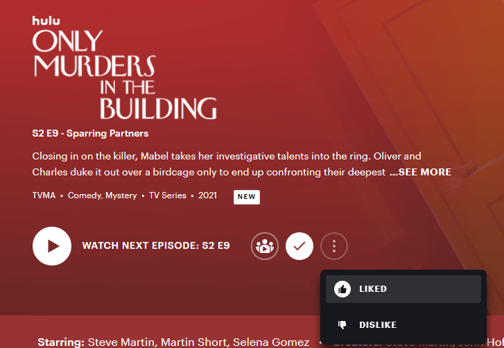
Hulu literally hides the like / dislike feature under a “…” that solely exists for that one feature!
Hulu actually removed their watchlist row years ago and replaced it with a hub called My Stuff. It would be cool if they also left the row on the home screen. They don’t seem to understand how people use streaming services. Nobody wants to click to a separate page just to see the content they had set aside to watch.
Most streaming services have a row on the home screen and a separate page for managing all the content. Hulu basically removed half of the implementation and replaced it with the other half.
Over the past few years, Hulu has revised its UI but has not added important or basic features. It’s borderline hilarious that their profile selection screen still doesn’t have avatars. They’re not just silly fun, they make your profile feel unique and invite you to hang around for a while. They also help you select your profile quickly. Who wants to look at a screen with 7 names and no visual identifiers?
I’ve heard a lot from inside sources that Hulu’s tech is “long in the tooth” and that Disney has basically halted any development progress.
In Hulu’s case, they could make the service a lot more modern with a few quick additions: profile avatars, a shuffle button, and autoplay trailers on the home screen. The only good thing about Hulu’s UI is they actually have a “like” feature putting them in a unique position along with Netflix.
Particularly in this age of “likes”, it’s wild that not even one of the new-era services included this feature at launch or built it in their first 2 years. Unfortunately, the like feature is hidden behind a … for some ridiculous reason.
Prime Video
Pros:
- New UI is a long overdue, Netflix-inspired joy
- Beautiful new Top 10 list
Cons:
- Still missing a like / dislike feature
- Does not tell you when titles are “new” with any form indicator flag
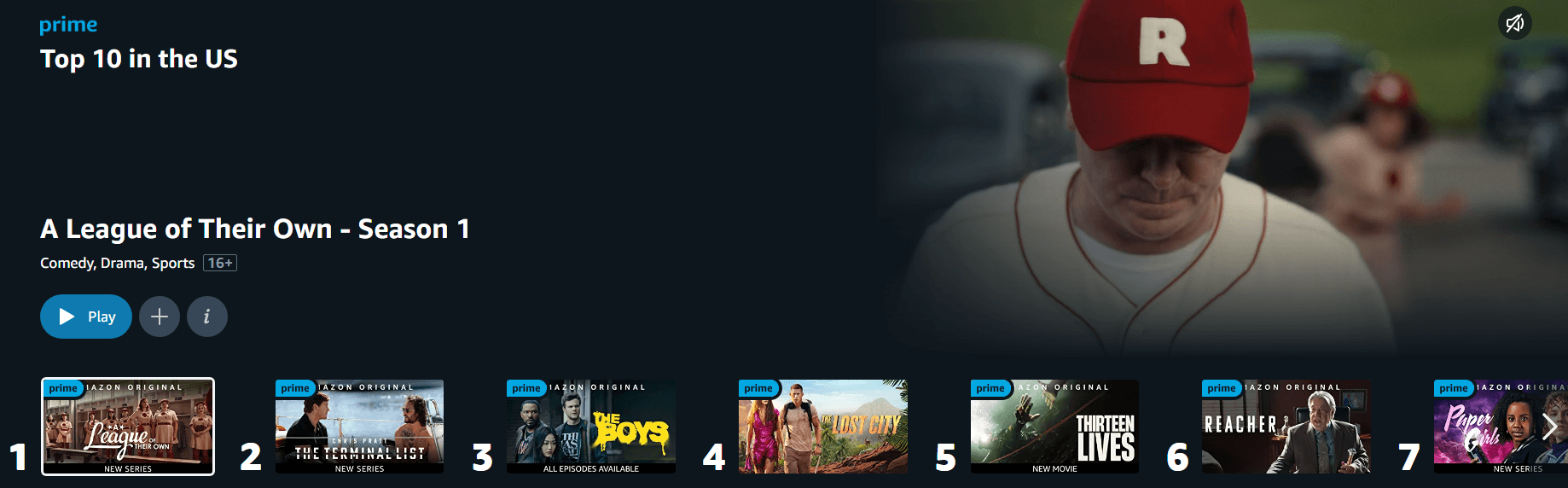
Prime Video’s new top 10 carousel
The new Prime UI is leaps and bounds ahead of the old one.
Hopefully, with this new stack, they’ll iterate more often and add other features. They only added profile avatars about a year ago, but being able to set it up so a bunch of Kimiko’s (from The Boys) are staring at you somehow makes every streaming experience more exciting.
Their new UI is often compared to Netflix across all devices, so there’s not much more to say here. Imitation is the sincerest form of flattery.
Disney+
Pros:
- It’s clean and basic (barebones?)
- First service to add GroupWatch style feature
- Most granular parental controls of any service
- Collections are cool, now everybody is doing them
Cons:
- Prioritized GroupWatch over basic features that remain missing 2 years later
- Have not added a new feature in almost 2 years (beyond refining parental controls)
- One of only two services (alongside Peacock) without a “remove from continue watching” feature
- Watchlist row they’re “testing” is placed between middle and bottom of homescreen
- Only service that misleads by not provide warnings before removing titles
- Only non-full screen hero of any major service (amateur appearance)
- Like Prime, no indication that content is newly added on title pages or thumbnails.
- Requires more clicks than other services to do simple things
- Worst series episode navigation (5 at a time in a horizontal slider) of any service
Disney+ makes browsing episodes frustrating and shows like BIA with more than 50 episodes in a season are ridiculous to manage.
If I’m harsh, it’s because Disney+ is the horse I backed to win it all, and instead when it comes to UI, they’ve done nothing but disappoint.
As you can see from the chart, they have multiple “we’re the only service without this” knocks. The company’s obsession with splitting its library between multiple services (Star+, ESPN+, Hulu, etc.) has resulted in its flagship service lagging behind in the US.
I’ve spoken to some former employees and learned that behind the scenes, Disney+ is stuck in the past with leadership that has “no business” dictating what’s appropriate for a modern service. One person said it was as if “their knowledge of tech stopped in the 90s, and they don’t think anything past that point is valid.”
Disney+ could rapidly improve with a few swift tweaks and new feature drops. I’d suggest making the hero full-screen with autoplay video, moving the watchlist row to the top of the home screen (where all other services have it), and scripting a “remove from continue watching” feature before Peacock does it and leaves Disney+ with yet another “only service missing this” note in that chart.
Prioritization of a like / dislike feature is next on the to-do list since the other new services haven’t done that yet, and revamp their search to return results for collections and episodes.
HBO Max
Pros:
- Best overall UI
- First service to add GroupWatch style feature
- Most granular parental controls of any service
- Collections are cool
- Best episode browsing of any service (beautiful grid)
- Episodes are separate titles
Cons:
- Hasn’t added many features
- Removed the autoplay trailer form their full-screen hero, a step back from all other services (except Disney+ which is the only one without a full-screen hero in the first place)
- Is a lame duck. Discovery+ and HBO Max are both shutting down in 2023 in favor of a new service with the “best of both worlds.”
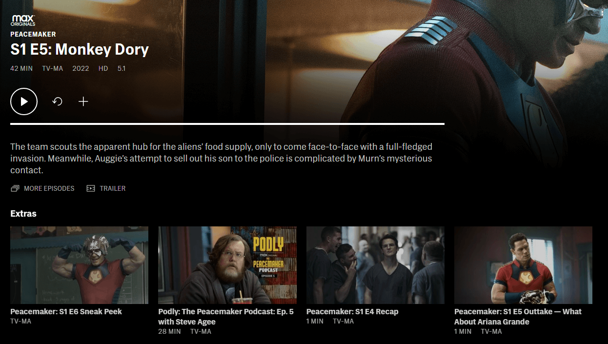
HBO Max gives each episode its own specific page
The HBO Max UI is gorgeous and clean, but they really screwed up the colors by replacing some of the purple with dark colors in their recent revision.
A couple of things they have always done differently that stand out include allowing episodes to show up in search results (common sense) and listing them as individual titles so they can even be added to the watchlist on their own. Each episode has its own page to house the metadata instead of cramming it all into the main title page for the series and giving text overload.
Peacock
Pros:
- Has a full-screen hero (no trailers, though)
- Tells when titles are expiring
- Linear channels are cool
- Added a Coming Soon row
- Title pages autoplay trailer in the background
Cons:
- Least progress since its launch
- Just behind Disney+ in battle for “worst” UI and least features
- One of only two services (alongside Disney+) without a “remove from continue watching” feature
Peacock has really big thumbnails on its home screen.
I think that Peacock and Disney+ are both suffering from Hulu’s existence. These companies need to get their heads out of their proverbial butts and focus on their flagship services which both are missing an astonishing number of features, basic, clunky, prone to bugs, and desperately in need of more development.
The best features they could add right now to compete better would be new indicators on thumbnails and the ability to remove titles from continue watching. In both cases, Disney+ and Peacock are pretty much the only ones without them. Peacock also has big thumbnails that might be good for visibility but waste screen real estate.
Paramount+
Pros:
- Adding new features faster than any other service
- New home screen hero is the best in the industry
- Industry-best “new indicators”
- Status messages on title pages
Cons:
- Only service without a Coming Soon section of any kind
- Clunky and slow UI
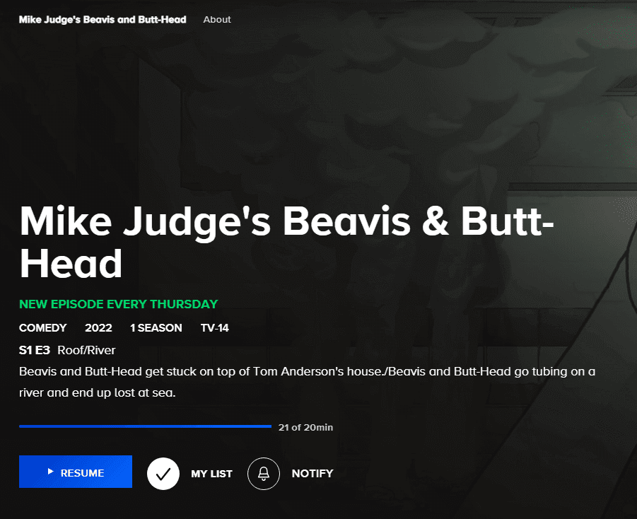
Paramount+ places status messages on most titles. In this case, “New episode every Thursday.” There are many variations depending on whether the series is new, old, complete, etc.
Paramount+ is the newest launched but the fastest improving.
Technically, it’s a rebranded CBS All Access but most features have been added since the rebrand. The CBS All Access service was bad – it didn’t have profiles, avatars, watchlists, or most basic features.
Paramount+ tested a like / dislike feature a year ago, but has yet to roll it out fully. If they do that and throw in a Coming Soon feature, they’ll basically be caught up to Netflix, which is pretty awesome. I also want to praise them for their new full-screen hero, the best in the industry. Not only does it autoplay video of the featured title and slides to a new title after about 10 seconds. Brilliant. They’ve found the best of all words. It starts as a still image, then converts to video. At any point, the user can advance to the next slide and a little time indicator shows how long until the next slide and how many slides. Why haven’t all services haven’t figured out that it’s possible to promote numerous titles there and still include the video? I also must thank them for ensuring the video starts muted and it’s your choice to unmute!
Which streamer’s website has the best UI and experience, in your opinion? Let us know in the comments down below.