
Picture Credit: Getty Images
Netflix is rolling out a brand-new test starting today (July 29th) for its TV application, tweaking the video player interface to make pausing, adjusting subtitles, and joining live events easier, with the hope of making the viewing experience more seamless.
Following up on the major TV homepage redesign unveiled last May—which focused on helping members easily find something great to watch—this new test focuses entirely on what happens after you hit play.
So, what exactly is being tested on your TV screens? Here’s a breakdown of the new features rolling out:
Streamlined Play/Pause Controls and Removed Back Button: In the early days, Netflix had to account for a wide range of input devices in its connected TV experience. Over time, however, smart TVs and streaming devices have converged and become much more streamlined, meaning most apps now behave similarly.
To that end, the on-screen play and pause buttons are being removed.
Of course, the ability to play and pause remains, but you’ll just use your device’s middle button or dedicated play/pause buttons on your remote—something you probably already do. Likewise, the on-screen back button, which historically sat in the top left of your screen, is also being removed, as most users already rely exclusively on their remote’s back button to return to the menu anyway.
Other Icons See a Shuffle: All the other icons you expect are here, but they have been consolidated down to the bottom-left side rather than split between the top-left, bottom-left, and bottom-right. ‘Skip Recap’ is the most prominent icon to make the move from the right side, while options like ‘Next Episode’ and additional settings now sit just above the main scrubber, which is notably a bit larger.
Unified Audio & Subtitles Menu: Tweaking your language settings is getting much less intrusive. Netflix has consolidated the audio language, subtitle, and subtitle-appearance controls into a single settings menu. The best part? The menu now appears as an overlay, meaning members can update their preferences in one view without pausing the movie or show they’re watching. This menu has also shifted to the bottom of the screen rather than pulling out from the right side.
Live Events Prompts: The smallest new update comes for live events. As Netflix pushes further into live programming (like their massive WWE deal), the player is adapting. When members click into a live event from the top carousel that is already underway, they’ll now be greeted with a clear, immediate choice: start from the very beginning, or jump straight to what’s happening live. This prompt replaces the old ‘More Info’ button.
Here’s some first looks at the test that’s rolling out to select users starting today:
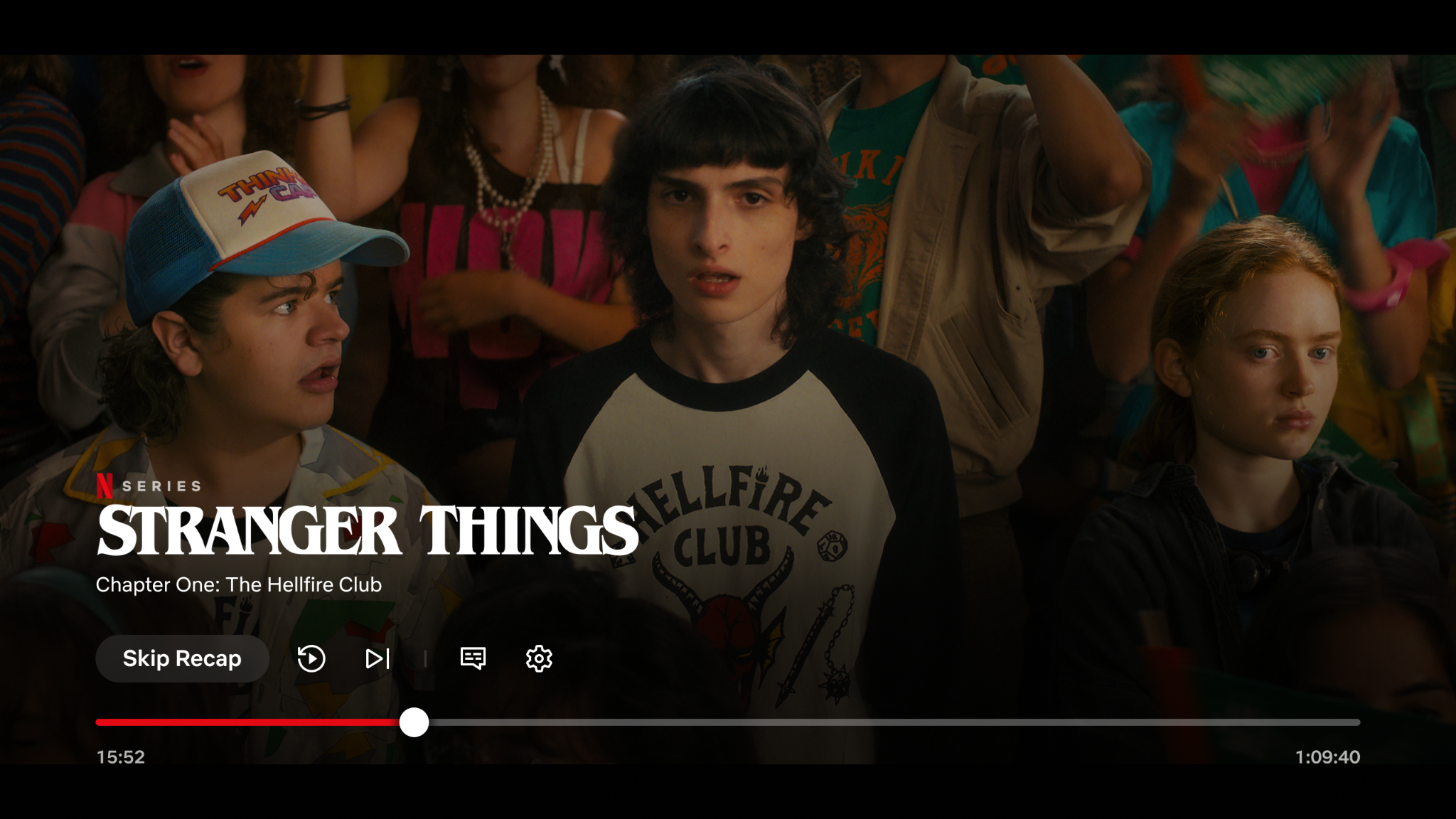
The Updated Netflix UI Player on Connected Devices
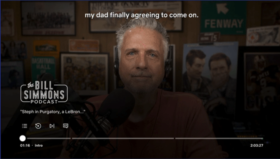
The Updated Netflix UI Player For Podcasts With Chapters on Connected Devices
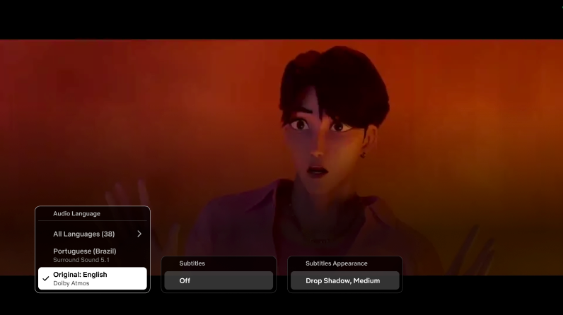
Updated language options on Netflix’s New UI Player
Of course, Netflix running tests is by no means news; it has many ongoing at any given point. As we covered just last month, the streamer has introduced free trials for many international markets (excluding the UK/US) and is constantly testing design and feature iterations (with the occasional removal, too). Since we last covered the web user interface, it has also evolved, with menu items now spanning across the top of the page.
We should also mention that over the past week, Netflix has added new design elements to Games and Podcasts within the TV app, giving these categories a distinct white icon on a dark background in the top corner of the tile, rather than the red one previously used. The Top 10 icon on title cards has also shifted from the top-right to the top-left corner.

New icons for Games and Podcasts
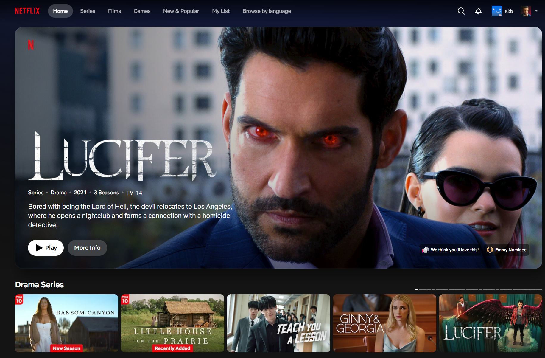
The most recent update to Netflix’s change to its web user interface
These are all minor tweaks, but they add up over time. Given that this is a test, Netflix will collate the data and drive broader changes based on its findings.
Have you received the new video player UI on your smart TV or streaming device yet? Let us know what you think of the new controls in the comments below.