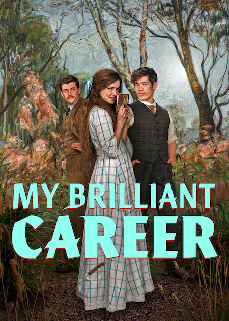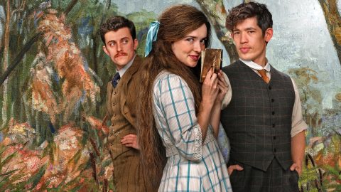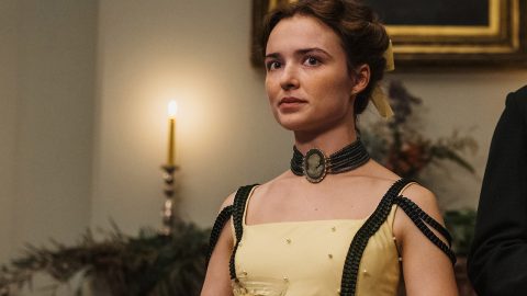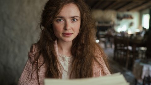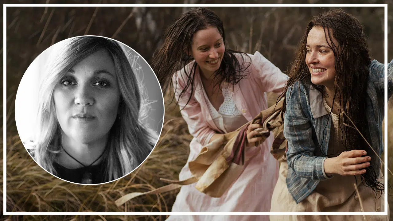
My Brilliant Career opens in Australia in the year 1900. It’s a new century for author Miles Franklin’s protagonist, Sybylla Melvyn (Philippa Northeast), an aspiring author and trailblazer. Since Sybylla is ahead of her time in many ways, so is the series from Liz Doran – including the lavish production design from Felicity Abbott.
Abbott got to pull from a variety of sources for the show’s main locations, including Five Bob Downs. The production designer brings history to life through a lens that calls for thinking outside the box. Abbott reflects Sybylla’s creative spirit in the spaces.
Recently, the production designer – who did very good work on The Invitation and Upgrade – spoke with What’s on Netflix about creating the world of My Brilliant Career and her passion for color theory.
As someone who studied film in Australia, how did it feel to go back there to work on My Brilliant Career?
It was amazing, actually. It was my first time being back there since 2017 when I moved to LA to start working in the States. It was really lovely to go back for such a beautiful project, particularly a historical project, which they’re always dear to my heart, these historical projects.
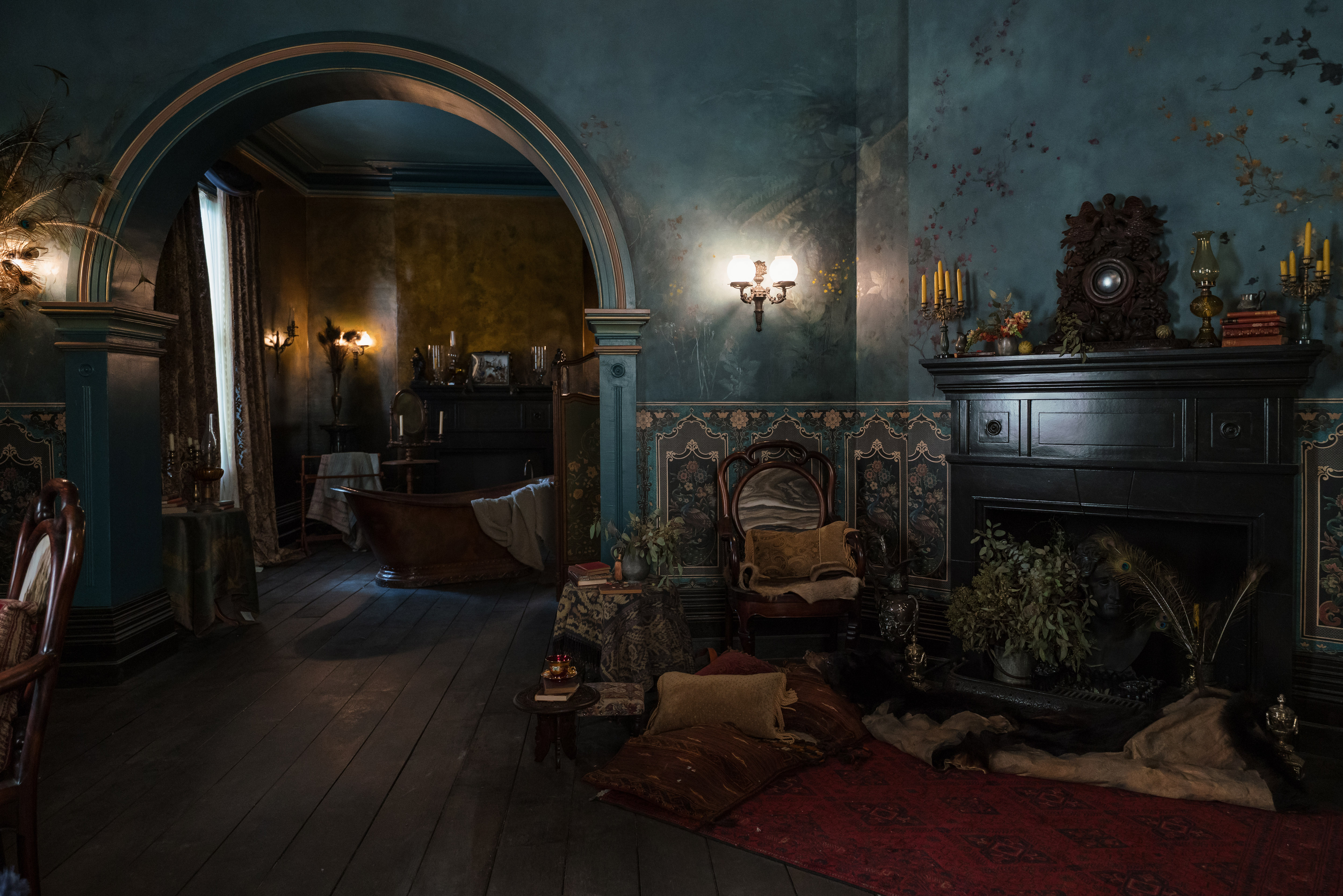
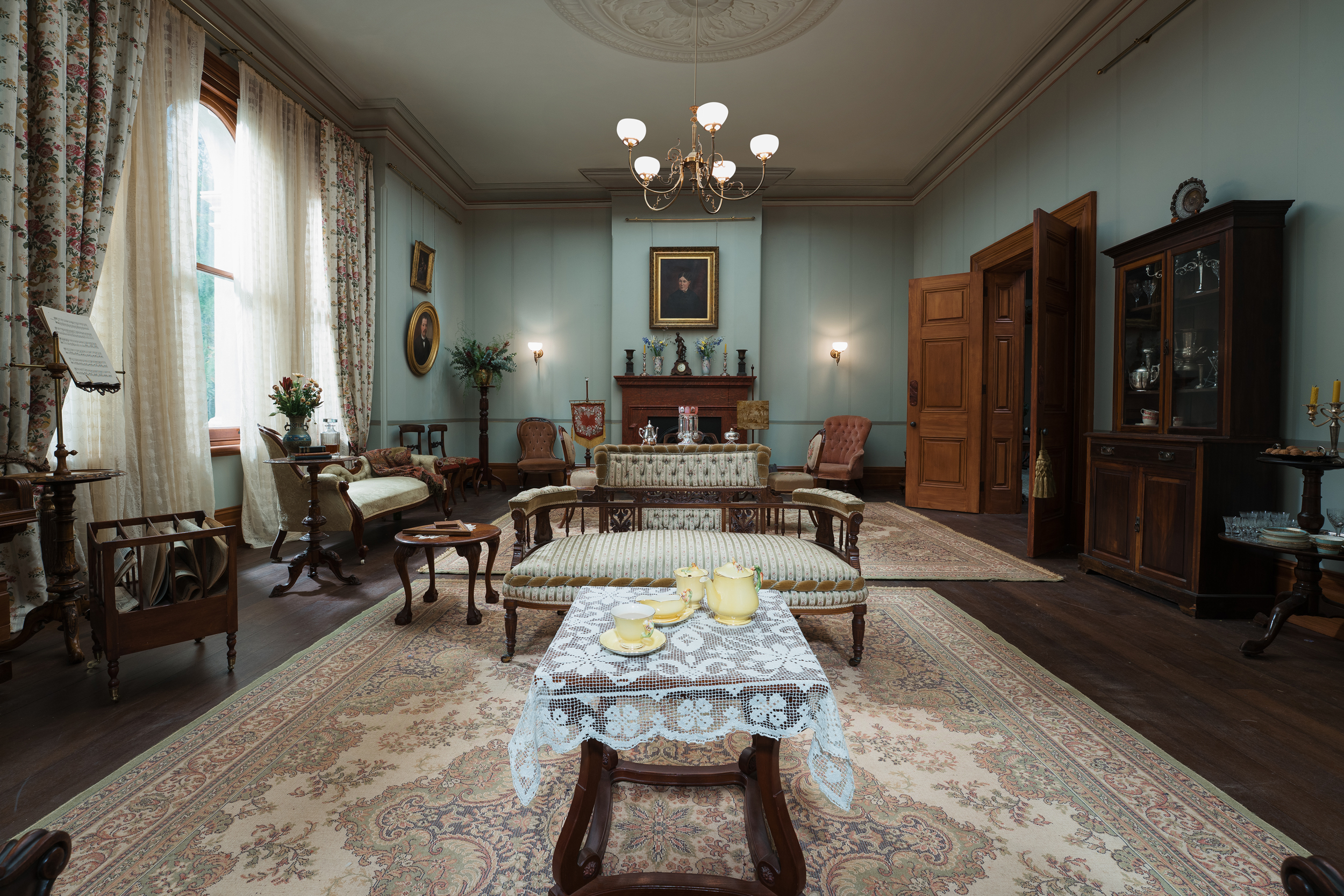
My Brilliant Career. Interior of Caddagat from My Brilliant Career. Cr. Ian Routledge/Netflix © 2026.
What really speaks to you about the period pieces?
It’s just part of my absolute love of world building, I suppose you could say. For me, it’s about the research process. I’ve only done a couple of things in my career that have been contemporary. And when I first did something that was contemporary, I was like, how do I do this? Because designing period and historical projects, it’s such a process.
It’s about obviously going into the deep dive of the period and saturating myself with images through painting, fine art and social documentary photography, depending on what the period is. But the contemporary, it’s kind of like, well, how do you narrow it down to designing a contemporary piece?
It’s very much something that I’m very familiar with and very comfortable with. Whether it’s the past or the future, I just really love building those worlds.
Were there any particularly satisfying moments where history and this story came together so well in your mind where like, oh, this detail really suits this story we’re telling?
My Brilliant Career was great. I mean, the writing was absolutely sensational, which is what drew me to the project. A couple of people, the showrunner, Liz Doran, and producer Paul Ranford, I’d worked with previously in Australia.
Some of the characters are just so wild, particularly Augusta, whose character environment is Five Bob Downs, which is why we wanted a sort of architectural arc across the show. So the mansion, I suppose, they live in, it’s a stone house, which you can find in South Australia, stone sort of manor, but it looks very Mediterranean. I’ve sort of pushed it in that direction in terms of the production design and the greens and all the landscaping and the set decoration because it really suited the character. Augusta’s very heightened. She’s quite sort of avant-garde. And so, I wanted a really real contrast to the kind of classic Victorian Australian home, which is Caddagat.
So the set decorator, when we were discussing the set decoration for Five Bob Downs, I mean, it was a dream for the set decorator, Emma, because her and her team have just got to create these really just very luscious, very painterly environments inside the house.
We built certain parts of the interior on stage as a set in order to control the palette and the textures. And obviously, lighting is always an issue on historical dramas, so you don’t have switches and stuff everywhere. We’re obviously mimicking gaslight because of the period; it’s pre-electricity in Australia.
It was all these European influences and all these other influences that came together in Five Bob Downs, which are not specifically Australian, but the character really called for that kind of detail and that sort of approach.
Even the soundtrack alone, did that kick open some doors to be more expressive in production design?
Yeah, yeah, exactly. Exactly. The director, Alyssa McClelland, the setup director, had some very specific references for music. Sofia Coppola’s Marie Antoinette was one of those references, and I loved that film when I saw it, but you know how it had a sort of punk soundtrack.
Yeah, New Order and all that. Great movie.
Exactly. It was the tone when we were making it. Even though the production design and certainly the costume, there’s very much a basis of historical accuracy, which is obviously important for period drama. But then there’s this kind of stylized kind of elevation, particularly with certain characters like Augusta and Five Bob Downs, it’s really called for.
But we are always in the art department, we have a kind of soundtrack running through our head. So it’s great that you mentioned that. And from what I’ve seen of the show, the soundtrack is, it has its own kind of mood. It’s definitely a departure from the original film, which was a classical score. This very much has its own sort of mood that encapsulates the show, I think.
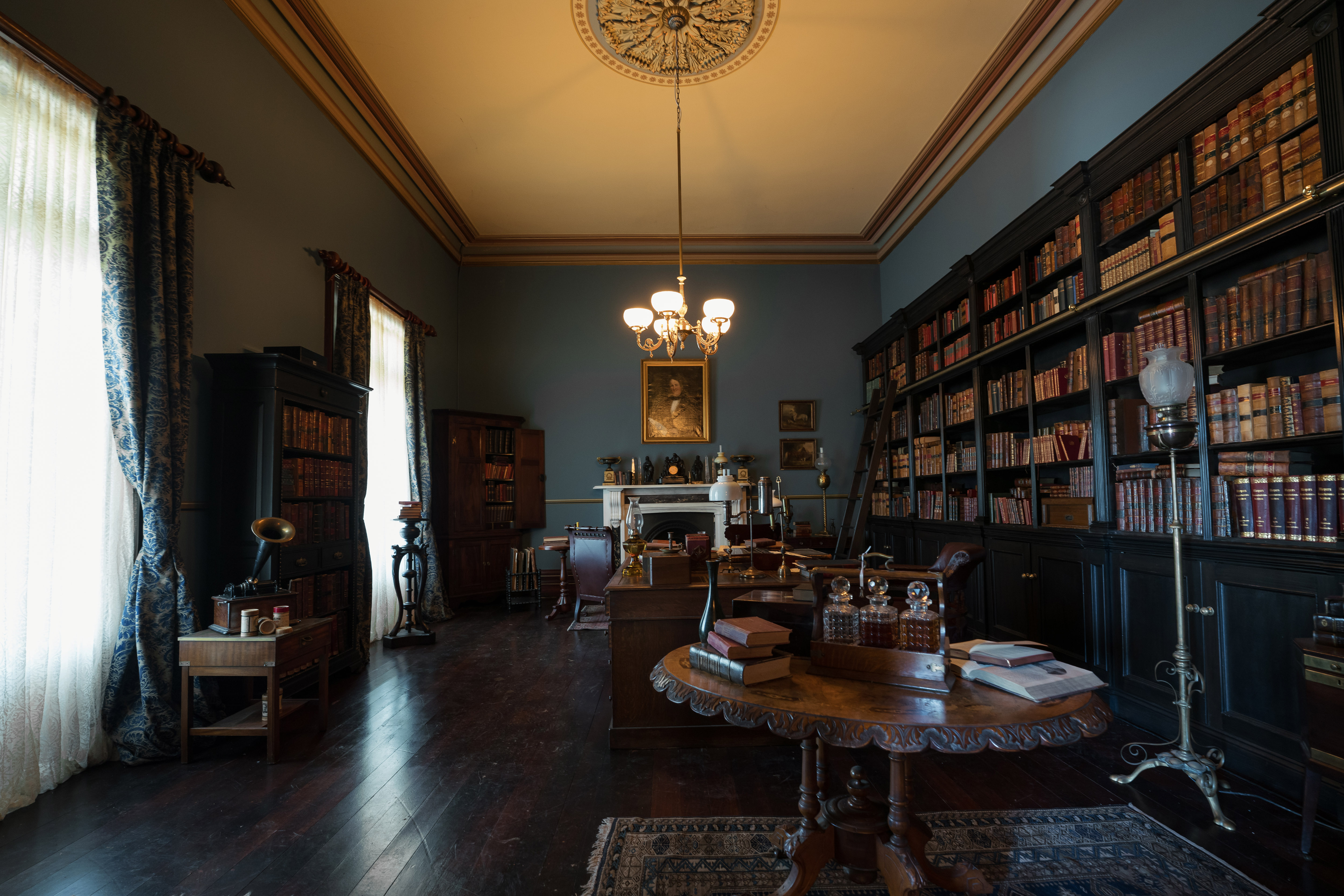
Beautiful work on the library for Sybylla – a dream space for any reader. You really feel her joy entering that space. How’d you want to create warmth in that set?
Well, I’m glad you like that set. I really had to fight for that because certain parts of the interior, like Sybylla’s Five Bob Downs bedroom, we built on stage because there was a big bath and it was plumbed through the bottom of the set. And that was one of the rooms we actually had to use on location because we needed the connector from the interior to the exterior.
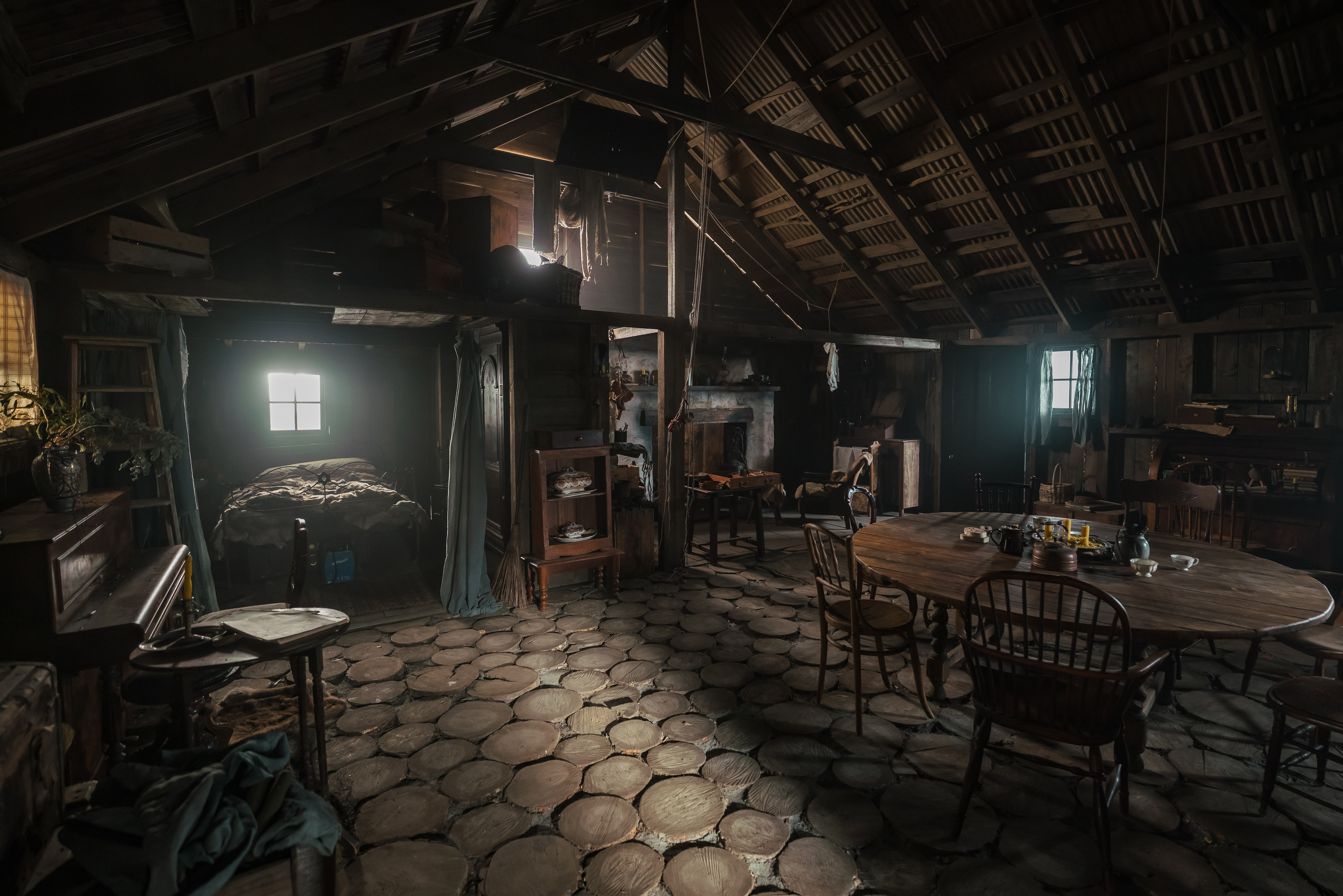
Originally, it was just a sort of parlor, like a living room, this room on location. It had nothing in it. In my mind, I wanted to have it totally booked out, like wall-to-ceiling books, because obviously it’s very important. The whole idea of Five Bob Downs was that it was just supposed to be very seductive for Sybylla coming from her tiny little cottage where she grew up. And then she goes through Caddagat, which is much more formal, classically Victorian in tone.
When she arrives at Five Bob Downs, it’s like this wild feast for the eyes and obviously the full-on library experience as you’ve seen. We sort of built into the location with all these bookcases and then the set decorator, I mean, painted the whole thing, did a complete number with all the furnishings and the books and all the set decoration and all the period furniture. It was completely transformed, but I think it worked really well. It’s a nice contrast to the rest of the house.
My Brilliant Career. Interior of Five Bob Downs from My Brilliant Career. Cr. Ian Routledge/Netflix © 2026.
You studied color theory. You continue to study color theory. On a show like My Brilliant Career, how do you see the story through color?
Oh, it’s all about color for me. My undergrad was fine arts in New Zealand, so as opposed to other routes that production designers come to the craft, I come from a fine arts background. Color and texture is really the fundamental of all of my study. And certainly, when I was doing my master’s at film school in Australia, and then I went on to Paris to finish my thesis.
I did a lot of exploration co-jointly with a cinematographer just in the analysis of color and texture on different film stocks. We were kind of at the cusp of film to digital, so we were filming a lot on 35 mil and putting it through different processes, and then also filming on digital cameras doing the same. Really, that formed the foundation of my entire career.
I mean, it was such a luxury and a privilege, but it also gave me the language to talk to cinematographers and understand not just color theory, but also color temperature, how lighting interacts and influences color. Also, the post-production process and how the grade and how colorists interact with all of that and how it can potentially enhance or sometimes change your work. Just all of those considerations that I think it’s so important for production designers to have that language to be able to have those conversations with the right people.
So, on My Brilliant Career, are there certain colors in specific spaces you really hope have a subconscious effect on viewers?
I suppose color for me is a language, and I’ve often said in interviews that for me, it’s my first language. It was inherently the first language I spoke. So for me, my response with color is quite intuitive and it’s something I’ve obviously developed through my career, but it’s not used randomly in the same way that language isn’t.
There’s a specific palette that’s ascribed to each character in each environment for particular emotional reasons or for reasons of tone and style. Sometimes that’s quite counterintuitive to the story itself. For example, I remember on a show once where there was a very dramatic scene and it was a historical drama, but it was a very tense and dramatic scene. For some reason, I felt strongly about the fact that the wallpaper should be Anaglypta, like a textured thing, and then it should be kind of marigold, which you would think is kind of a bit counterintuitive to what some designers would just paint it in cool tones because that’s what you would typically expect.
What it did was it almost created a heightened emotional response to people that were watching it, I think. It was quite interesting to me. I started to explore that a bit more after that. It’s not necessarily just the typical response of cool tones next to a more dramatic scene or a more emotional scene and the reverse for a happy moment. I think sometimes when playing with those things, I work a lot with secondary and tertiary colors rather than primary colors.
You really get into the subtleties of it. We always hand mix colors. I always get my charge hand scenics to mix things specifically. I drive them mad [Laughs]. But yeah, for me, it’s all about color. I mean, it’s literally just the language. It’s how I just prescribe the visual narrative. It’s all about color and texture.
Given the endless colors in the world, how do you continue to develop or refine that language?
I mean, that’s a great question, but absolutely. I should say that camera testing is probably the most important thing that goes along with that because it’s not typically something that’s done specifically for the art department. It’s obviously done for hair and costume and makeup at a certain point in the pre-production process, but it’s something I always talk about early on.
It’s something that we schedule probably a couple of times, even if it’s just with a stills camera, replicating the camera that we’re going to use for the shoot. It’s so important because it’s where all the information comes, where you’re approximating the DP’s there, you’re approximating lighting. The DP will grade it with a colorist if that’s appropriate or they’ll do their own grade.
And so, then you really start to get the language of, okay, well. So typically in that process, I’ll test a band of colorway, which is two stops and then one, and then the color and different layers of different glazes and sheen levels really to see how the lighting’s going to behave on the color.
Because it’s one thing to look at it by the eye, but then it’s another thing to see how it behaves through the camera. And then also what their post-production process is going to be with the colorist and through the grade and stuff.
And then is there ever the question of, what does a cinematographer think of a certain color? For example, some cinematographers hate red or white.
I’ve never had that, actually. Usually I get the opposite, especially Australian DPs, because there’s such a lot of excess fenestration. There’s this obsession with natural light coming in, and Australian houses typically have a lot of windows, and there’s a lot of white. So usually I get from DPs, it’s like, oh, thank God there’s color on the wall.
I mean, my response to that is white is not a color. It’s a missed opportunity. It’s an empty canvas. I think about various skin tones, depending on who the cast are, but it doesn’t really tell much of a story for me.
DPs love saturated color. I’ve had amazing results working with DPs using really high sheens to bounce light around a set on ceilings and walls. I think that’s the beauty of the amazing opportunity I had with my education to work so closely with cinematographers and develop that language together.
My Brilliant Career. Interior of Barney Gap from My Brilliant Career. Cr. Ian Routledge/Netflix © 2026.